Topics & Articles

Home

Culture

Ethnic Groups

History

Issues

Links

Viet Nam


Search

or Browse the Archives

or Gets Posts by Tags


Most Popular Books on Asian-Nation

Miscellaneous

All posts copyright © 2001- by C.N. Le.
Some rights reserved. Creative Commons License

The views and opinions expressed on this site and blog posts (excluding comments on blog posts left by others) are entirely my own and do not represent those of any employer or organization with whom I am currently or previously have been associated.

Blog powered by WordPress


Behind the Headlines: APA News Blog

Academic Version: Applying my personal experiences and academic research as a professor of Sociology and Asian American Studies to provide a more complete understanding of political, economic, and cultural issues and current events related to American race relations, and Asia/Asian America in particular.

Plain English: Trying to put my Ph.D. to good use.

February 16, 2011

Written by C.N.

State Population Data from 2010 Census

Following up on my earlier post about a few interesting interactive infographics showing population-related data from the Census and other sources, the Census Bureau has begun to release results from the 2010 Census for each state and has created an interactive application (below) that summarizes changes in the state’s population by counties and racial/ethnic group (to change states, click on the “Select Another State” link at the top of the graphic):

Data for more states will be released in the next few months, so if the state you’re interested in is not yet listed, check back a little later and eventually it will be up.

The Census has another interactive graphic below that shows state-level changes in population from 2000 to 2010, along with historical changes in population for each state since 1910. This is basically the data upon which state governments will use to reapportion their Congressional districts in time for the next Congressional elections in 2012. You might recall that a few states will lose one or more seats in the House of Representatives (most of whom are in the midwest and northeast) because their population either declined or was stagnant while other states (mainly in the south and west) will gain seats because their populations increased.

February 2, 2011

Written by C.N.

3 Interesting Infographics: Interracial Marriage, Surnames, and Slavery

In my travels around the internet, I recently came across three interesting infographics related to race/ethnicity and immigration.

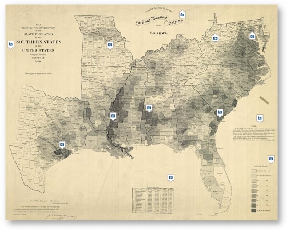
The first one is a “Map of American Slavery,” published in the New York Times (small thumbnail below, you can click on it to go to the larger version at the NY Times site). For casual historians like me, it is interesting to see that the counties that had the highest concentration of slaves were generally located along the Mississippi River and whose labor was in demand the most to facilitate trade, further reinforcing the notion that so much of the American south’s economy was fundamentally tied to slavery.

Map of American Slavery © Geography and Map Division, Library of Congress

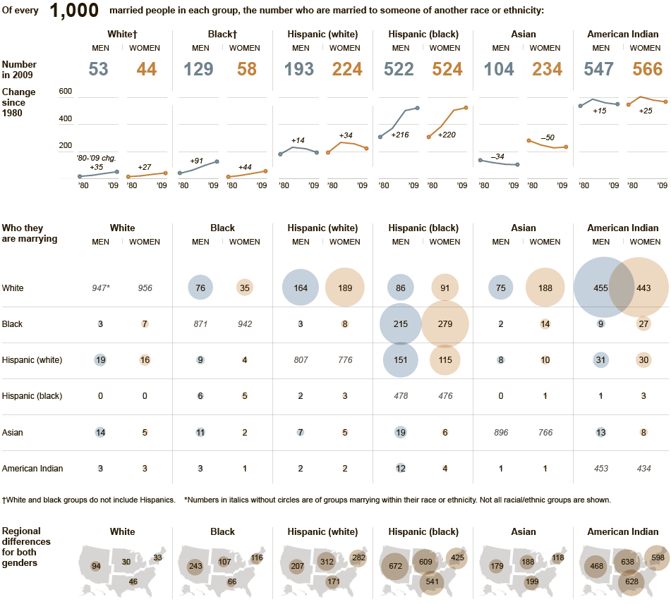
The second interesting infographic is entitled “Who is Marrying Whom,” also was published by the New York Times, and shows a visual breakdown of interracial marriage across the major racial/ethnic groups in the U.S. (again, you can click on the thumbnail below to see the full-size version). In looking it over, some of the most interesting results are:

Who is Marrying Whom © New York Times
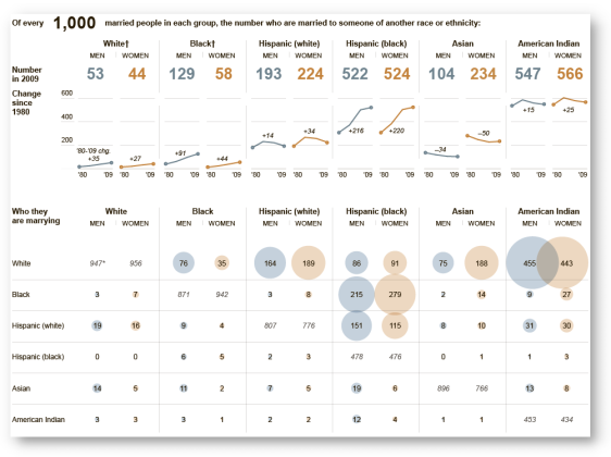
  • The groups that seem to have the highest rates of being interracially married are American Indians and Black Hispanics.
  • The largest gender disparities are among Blacks and Asian Americans, although the gender pattern is the opposite for each: Black men are 124% more likely to be interracially married than Black women, while Asian American women are 125% more likely to be married interracially than Asian American men.
  • Since around 1990 or so, interracial marriage rates have actually been declining for White Hispanics and American Indians. Moreover, for Asian Americans, they’ve been generally declining since 1980. For White Hispanics and Asian Americans, I believe much of this decline is due to the large influx of immigrants since the ’80s and ’90s, many of whom are already married as they arrive in the U.S. or are less likely to intermarry in general. As such, it would be interesting to see these same numbers for just U.S.-raised members of these racial groups (those who were born in the U.S. or arrived at at 13 or younger and therefore, and therefore were socialized within the U.S. racial landscape).

The interracial marriage graphic is linked to an interesting article also on the NY Times site that discusses the growing multiracial/mixed-race population in the U.S. and how they are increasingly forging their own identity that combines elements of both sides of their ancestry, rather than trying to fit themselves into preexisting and frequently narrowly-defined racial/ethnic categories, as this video clip shows:

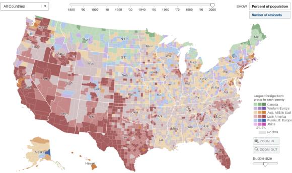
A third interesting infographic was published by the National Geographic Society, titled “What’s in a Surname?” and shows some of the most common surnames in different geographic parts of the U.S. The map confirms what demographers have noted for some time now — racial/ethnic minorities (represented here by their surnames) are increasingly becoming the majority population in many parts of the U.S. (again, click on the thumbnail below to view the larger interactive graphic at the National Geographic Society site).

Map of American Surnames © National Geographic Society

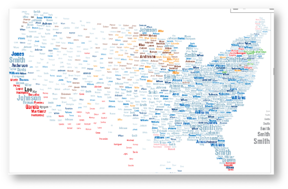
As one example, in the southern California part of the map, some of the most common surnames are Garcia, Martinez, Hernandez and even Nguyen (a nod to the huge Vietnamese American “Little Saigon” community in Orange County). There are further large concentrations of Latino surnames (represented in red) in the southwestern U.S., southern Florida, and upstate New York as well. And unbeknown to me, there is apparently a large contingent of Koreans named “Kim” in central California.

March 19, 2009

Written by C.N.

Interactive Immigrant Settlement Map

I just came across a nifty interactive infographic from the New York Times that tracks geographic settlement patterns of major racial/ethnic immigrant groups throughout the United States by decade, from 1880 to 2000: the Immigration Explorer.

Immigration Explorer by the New York Times

For every group included in the graphic, you will notice that as the decades pass, their settlement patterns become more dispersed throughout the country. In other words, in the past, immigrants would concentrate in the traditional major metropolitan areas of New York, Los Angeles, San Francisco, and Chicago.

But these days, immigrants have spread out and are settling into new “gateway” areas — areas that aren’t used to having large immigrant populations. And unfortunately, these demographic shifts can and have led to some tensions between old-time residents and the new arrivals. For more research on the new settlement patterns of contemporary immigrants, I recommend books such as: