The views and opinions expressed on this site and blog posts (excluding comments on blog posts left by others) are entirely my own and do not represent those of any employer or organization with whom I am currently or previously have been associated.
Academic Version: Applying my personal experiences and academic research as a professor of Sociology and Asian American Studies to provide a more complete understanding of political, economic, and cultural issues and current events related to American race relations, and Asia/Asian America in particular.
Plain English: Trying to put my Ph.D. to good use.
The U.S. Census Bureau has finalized their official data on our nation’s population and has just released their report brief “The Asian Population: 2010” that summarizes its major findings about the Asian American population in 2010, and in particular, how it compares to the last decennial Census taken in 2000. Below are some of the most significant highlights.
Growth Since 2000
The Asian American population (monoracial and mixed-race) grew from 11.9 million in 2000 to 17.3 million in 2010. This represents an increase of 45.6% since 2000. This proportional increase from 2000 is the highest of all the major racial/ethnic groups (in comparison, the Latino/Hispanic population grew 43% from 2000 to 2010.
Increases Within Each Ethnic Group
Among the six largest Asian ethnic groups (monoracial and mixed-race), who collective make up over 87% of the total Asian American population, Indians experienced the largest increase — 67.6% — since 2000. All Asian ethnic groups (monoracial and mixed-race) that had a population of at least 1,000 in 2000, Nepalese experienced large increases in their population — from 9,399 to 59,490 in 2010, an increase of 533%. Overall, the largest Asian ethnic group is the Chinese at 3.8 million (monoracial and mixed-race).
Huge Increase in Mixed-Race Asian American Population
Mixed-race Asian Americans (those who self-identified as having some Asian ancestry) increased from 1.6 million in 2000 to 2.6 million in 2010, an increase of 60%. Of all mixed-race Asian Americans, 61% self-identified as half White and half Asian.
Geographic Distribution
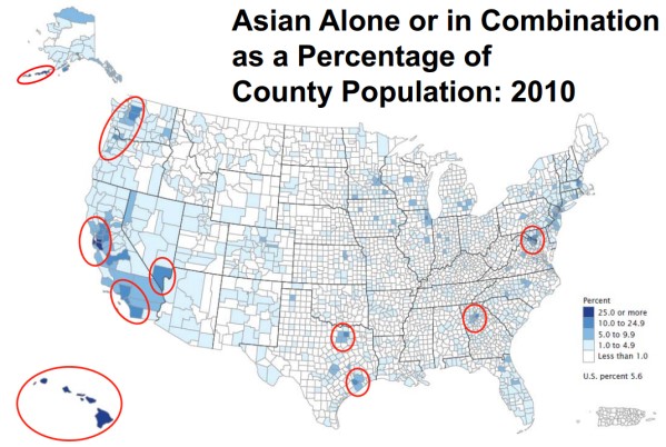
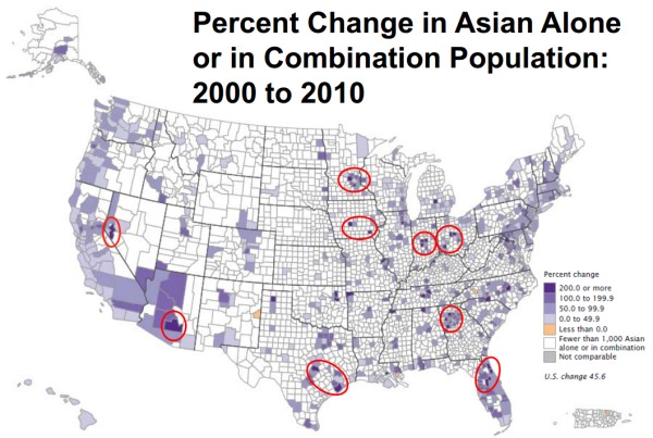
In terms of total numbers, the state with the largest Asian American population, not surprisingly, is California — 5.6 million Asian Americans lived in the Golden State in 2010 and they represented 14.9% of California’s total population. But the state with the highest proportion of its residents being Asian American is Hawai’i — 57.4% of the Aloha State’s population is Asian American. The state that experienced the biggest increase in its Asian American population from 2000 to 2010 is Nevada — from 112,246 to 242,916, an increase of 114%.
The first map below shows the proportion of Asian Americans by county in 2010. The second map shows the growth of Asian American residents by county in 2010.
Again, you can read more findings from the 2010 Census about the Asian American population in the Census Bureau’s recently-released summary report, The Asian Population: 2010.
Following up on my earlier post about a few interesting interactive infographics showing population-related data from the Census and other sources, the Census Bureau has begun to release results from the 2010 Census for each state and has created an interactive application (below) that summarizes changes in the state’s population by counties and racial/ethnic group (to change states, click on the “Select Another State” link at the top of the graphic):
Data for more states will be released in the next few months, so if the state you’re interested in is not yet listed, check back a little later and eventually it will be up.
The Census has another interactive graphic below that shows state-level changes in population from 2000 to 2010, along with historical changes in population for each state since 1910. This is basically the data upon which state governments will use to reapportion their Congressional districts in time for the next Congressional elections in 2012. You might recall that a few states will lose one or more seats in the House of Representatives (most of whom are in the midwest and northeast) because their population either declined or was stagnant while other states (mainly in the south and west) will gain seats because their populations increased.
To commemorate and celebrate the contributions to our nation made by people of African descent, American historian Carter G. Woodson established Black History Week. The first celebration occurred on Feb. 12, 1926. For many years, the second week of February was set aside for this celebration to coincide with the birthdays of abolitionist/editor Frederick Douglass and Abraham Lincoln. In 1976, as part of the nation’s bicentennial, the week was expanded into Black History Month. Each year, U.S. presidents proclaim February as National African-American History Month.
41.8 million
As of July 1, 2009, the estimated population of black residents in the United States, including those of more than one race. They made up 13.6 percent of the total U.S. population. This figure represents an increase of more than a half-million residents from one year earlier.
38%
Percentage of Mississippi’s population that was black in 2009. Although New York had the largest number of blacks of any state, Mississippi had the largest share of blacks in its total population. Blacks also made up more than a quarter of the population in Louisiana (33%), Georgia (31%), Maryland (31%), South Carolina (29%) and Alabama (27%). They comprised 55% of the population in the District of Columbia.
19%
Percentage of blacks 25 and older who had a bachelor’s degree or higher in 2009.
11.5 million
Among blacks 25 and older, the number who had an advanced degree in 2009 (e.g., master’s, doctorate, medical or law). A decade earlier, in 1999, about 900,000 blacks had this level of education.
2.5 million
Number of black college students in fall 2008. This was roughly double the corresponding number from 25 years earlier.
55%
Turnout rate in the 2008 presidential election for the 18- to 24-year-old citizen black population, an 8 percent increase from 2004. Blacks had the highest turnout rate in this age group.
65%
Turnout rate among black citizens in the 2008 presidential election, up about 5 percentage points from 2004. Looking at voter turnout by race and Hispanic origin, non-Hispanic whites and blacks had the highest turnout levels.
$32,584
The annual median income of single-race black households in 2009, a decline of 4.4 percent (in 2009 constant dollars) from 2008.
28%
The percentage of single-race blacks 16 and older who worked in management, professional and related occupations.
$137.4 billion
Receipts for black-owned businesses in 2007, up 55.1 percent from 2002. The number of black-owned businesses totaled 1.9 million in 2007, up 60.5 percent.
In my travels around the internet, I recently came across three interesting infographics related to race/ethnicity and immigration.
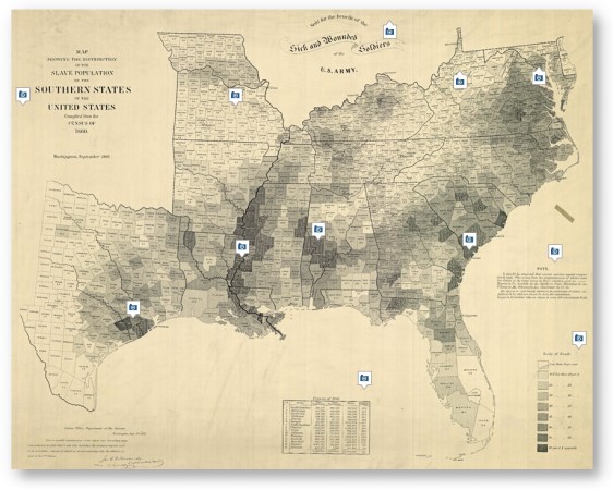
The first one is a “Map of American Slavery,” published in the New York Times (small thumbnail below, you can click on it to go to the larger version at the NY Times site). For casual historians like me, it is interesting to see that the counties that had the highest concentration of slaves were generally located along the Mississippi River and whose labor was in demand the most to facilitate trade, further reinforcing the notion that so much of the American south’s economy was fundamentally tied to slavery.
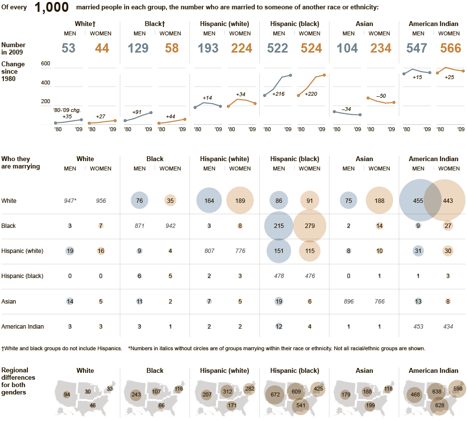
The second interesting infographic is entitled “Who is Marrying Whom,” also was published by the New York Times, and shows a visual breakdown of interracial marriage across the major racial/ethnic groups in the U.S. (again, you can click on the thumbnail below to see the full-size version). In looking it over, some of the most interesting results are:
The groups that seem to have the highest rates of being interracially married are American Indians and Black Hispanics.
The largest gender disparities are among Blacks and Asian Americans, although the gender pattern is the opposite for each: Black men are 124% more likely to be interracially married than Black women, while Asian American women are 125% more likely to be married interracially than Asian American men.
Since around 1990 or so, interracial marriage rates have actually been declining for White Hispanics and American Indians. Moreover, for Asian Americans, they’ve been generally declining since 1980. For White Hispanics and Asian Americans, I believe much of this decline is due to the large influx of immigrants since the ’80s and ’90s, many of whom are already married as they arrive in the U.S. or are less likely to intermarry in general. As such, it would be interesting to see these same numbers for just U.S.-raised members of these racial groups (those who were born in the U.S. or arrived at at 13 or younger and therefore, and therefore were socialized within the U.S. racial landscape).
The interracial marriage graphic is linked to an interesting article also on the NY Times site that discusses the growing multiracial/mixed-race population in the U.S. and how they are increasingly forging their own identity that combines elements of both sides of their ancestry, rather than trying to fit themselves into preexisting and frequently narrowly-defined racial/ethnic categories, as this video clip shows:
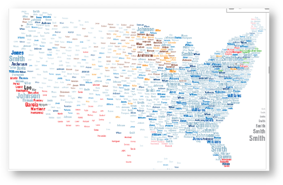
A third interesting infographic was published by the National Geographic Society, titled “What’s in a Surname?” and shows some of the most common surnames in different geographic parts of the U.S. The map confirms what demographers have noted for some time now — racial/ethnic minorities (represented here by their surnames) are increasingly becoming the majority population in many parts of the U.S. (again, click on the thumbnail below to view the larger interactive graphic at the National Geographic Society site).
As one example, in the southern California part of the map, some of the most common surnames are Garcia, Martinez, Hernandez and even Nguyen (a nod to the huge Vietnamese American “Little Saigon” community in Orange County). There are further large concentrations of Latino surnames (represented in red) in the southwestern U.S., southern Florida, and upstate New York as well. And unbeknown to me, there is apparently a large contingent of Koreans named “Kim” in central California.
Did you know that November is American Indian & Alaskan Native Heritage Month? Asian Americans share much in common with our Native American Indian and Alaskan brothers and sisters, not just in terms of social and cultural solidarity, but also similar anthropological ancestors as well. To celebrate their heritage, the U.S. Census Bureau has some a fact sheet with some interesting statistics:
The first American Indian Day was celebrated in May 1916 in New York. Red Fox James, a Blackfeet Indian, rode horseback from state to state, getting endorsements from 24 state governments, to have a day to honor American Indians. In 1990, President George H.W. Bush signed a joint congressional resolution designating November 1990 as “National American Indian Heritage Month.”
4.9 million
As of July 1, 2008, the estimated population of American Indians and Alaska Natives, including those of more than one race. They made up 1.6 percent of the total population.
29.7
Median age of the American Indian and Alaska Native population in 2008, younger than the median of 36.8 for the population as a whole. About 30 percent of American Indians and Alaska Natives were younger than 18, and 8 percent were 65 and older.
5
Number of states where American Indians and Alaska Natives were the largest race or ethnic minority group in 2008. These states are Alaska, Montana, North Dakota, Oklahoma and South Dakota.
18%
The proportion of Alaska’s population identified as American Indian and Alaska Native as of July 1, 2008, the highest rate for this race group of any state. Alaska was followed by Oklahoma (11 percent) and New Mexico (11 percent).
29%
Percentage of American Indians and Alaska Natives 5 and older who spoke a language other than English at home.
$37,815
The median income of households from the 2008 American Community Survey where the householder reported being American Indian and Alaska Native and no other race.
24.2%
The 2008 poverty rate of people who reported they were American Indian and Alaska Native and no other race.
$26.9 billion
Receipts for American Indian- and Alaska Native-owned businesses in 2002. These businesses numbered 201,387.
In addition, the Association of College & Research Libraries has also compiled a very useful list of internet sites and resources related to the Native American Indian population and their history, contributions, and experiences. Below are a few of the websites that I found particularly interesting:
September 15 through October 15 is Hispanic Heritage Month. Below is an historical summary and a few noteworthy statistics published by the Census Bureau for this occasion:
In September 1968, Congress authorized President Lyndon B. Johnson to proclaim National Hispanic Heritage Week, which was observed during the week that included Sept. 15 and Sept. 16. The observance was expanded in 1988 to a month-long celebration (Sept. 15 – Oct. 15). America celebrates the culture and traditions of those who trace their roots to Spain, Mexico and the Spanish-speaking nations of Central America, South America and the Caribbean.
Sept. 15 was chosen as the starting point for the celebration because it is the anniversary of independence of five Latin American countries: Costa Rica, El Salvador, Guatemala, Honduras and Nicaragua. In addition, Mexico and Chile celebrate their independence days on Sept. 16 and Sept. 18, respectively.
48.4 million
The estimated Hispanic population of the United States as of July 1, 2009, making people of Hispanic origin the nation’s largest ethnic or race minority. Hispanics constituted 16 percent of the nation’s total population. In addition, there are approximately 4 million residents of Puerto Rico, a Caribbean U.S. territory.
3.1%
Percentage increase in the Hispanic population between July 1, 2008, and July 1, 2009, making Hispanics the fastest-growing minority group.
22.4 million
The nation’s Hispanic population during the 1990 Census.
132.8 million
The projected Hispanic population of the United States on July 1, 2050. According to this projection, Hispanics will constitute 30 percent of the nation’s population by that date.
66%
The percentage of Hispanic-origin people in the United States who were of Mexican background in 2008. Another 9 percent were of Puerto Rican background, with 3.4 percent Cuban, 3.4 percent Salvadoran and 2.8 percent Dominican. The remainder was of some other Central American, South American or other Hispanic or Latino origin.
27.4 years
Median age of the Hispanic population in 2009. This compared with 36.8 years for the population as a whole.
107
Number of Hispanic males in 2009 per every 100 Hispanic females. This was in sharp contrast to the overall population, which had 97 males per every 100 females.
47%
The percentage of the Hispanic-origin population that lived in California or Texas in 2009. California was home to 13.7 million Hispanics, and Texas was home to 9.1 million.
46%
The percentage of New Mexico’s population that was Hispanic in 2009, the highest of any state (New Mexico had 916,000 Hispanics). Hispanics also made up at least one fifth of the population in California and Texas, at 37 percent each, followed by Arizona (31 percent), Nevada (26 percent), Florida (22 percent) and Colorado (20 percent).
50
Number of the nation’s 3,143 counties that were majority-Hispanic.
2.3 million
The number of Hispanic-owned businesses in 2007, up 43.6 percent from 2002.
$345.2 billion
Receipts generated by Hispanic-owned businesses in 2007, up 55.5 percent from 2002.
35 million
The number of U.S. residents 5 and older who spoke Spanish at home in 2008. Those who hablan español constituted 12 percent of U.S. residents. More than half of these Spanish speakers spoke English “very well.”
4
The number of Hispanic surnames ranked among the 15 most common in 2000. It was the first time that a Hispanic surname reached the top 15 during a census. Garcia was the most frequent Hispanic surname, occurring 858,289 times and placing eighth on the list — up from 18th in 1990. Rodriguez (ninth), Martinez (11th) and Hernandez (15th) were the next most common Hispanic surnames.
Below is an announcement about a research project and online survey in need of Asian American respondents.
Seeking Volunteers for Online Survey Study
My name is Nellie Tran, and I am a psychology doctoral student at the University of Illinois at Chicago. I am conducting a study to understand experiences of discrimination, racial consciousness, and their effects on their mental health for Asian Americans. Your voice and experiences could contribute greatly to an understanding the experiences of different racial/ethnic groups and those of different generational statuses. If you are interested in completing the survey, please access the survey at the following link.
Participation in this survey is voluntary and open to all individuals. The survey will take about 20-25 minutes to complete. You will be asked for an email address at the end of the survey in order to be entered into a random drawing for one $50 Amazon.com Gift Card. This research has been reviewed and approved by the University of Illinois at Chicago Institutional Review Board. If you have any questions, please feel free to contact me at the information below. Thank you so much!
Looking forward to hearing from you,
Nellie Tran, M.A.
Doctoral Candidate, Psychology
University of Illinois at Chicago
Ntran2@uic.edu
Each year, the Federal Bureau of Investigation releases its official report on Hate Crimes in the U.S. First, a little background — hate crimes are defined as a criminal offense committed against a person or property, which is motivated, in whole or in part, by bias against the victim’s actual or perceived race, ethnicity, religion, sexual orientation, or disability, and that is formally reported to law enforcement. This definition is important in many ways, as I explain a little later.
The number of hate crimes committed against Asian Americans and Pacific Islander Americans declined from 188 incidents and 219 offenses in 2007, to 137 incidents and 162 offenses in 2008.
Similarly, the number of hate crimes committed against Hispanic Americans declined from 595 incidents and 775 offenses in 2007, to 561 incidents and 735 offenses in 2008.
The number of hate crimes committed against Muslim Americans also declined, from 115 incidents and 133 offenses in 2007, to 105 incidents and 123 offenses in 2008.
These are positive signs of progress and we should acknowledge them as such. Unfortunately there appears to be at least an equal number of bad news as well:
In total, the number of reported hate crimes are at their highest level since 2001. In 2008, there were 7,783 hate crime incidents and 9,168 hate crime offenses reported, an increase from 7,624 and 9,006 reported in 2007, respectively.
The number of hate crime crimes directed at Blacks increased from 2,658 incidents and 3,275 offenses in 2007, to 2,876 incidents and 3,413 offenses in 2008. Such anti-Black hate crimes are at their highest levels since 2001 and are pretty clear evidence that despite Barack Obama’s election, racism against Blacks is still alive and well in America.
Hate crimes based on sexual orientation are also at their highest level since 2001, increasing from 1,265 incidents and 1,460 offenses in 2007, to 1,297 and 1,617 in 2008, respectively.
Aside from the decline in anti-Muslim hate crimes, there was an overall increase in the number of hate crimes based on religious bias in general. For example, the number of hate incidents and offenses committed against Jewish Americans increased from 969 and 1,010 in 2007, to 1,013 and 1,055 in 2008, respectively.
To further put these hate crime numbers in perspective, we should note the specifics related to how they were collected. Specifically, as in years past, the vast majority of the law enforcement agencies who participated in the data collection (84.4% to be exact) reported absolutely zero hate crimes — that there were no hate crime incidents in their particular jurisdiction.
In addition, thousands of police agencies across the nation did not participate in the hate crime data collection program at all, including at least five agencies in cities with a popular of over 250,000 and at least eleven agencies in cities with populations between 100,000 and 250,000.
Many of these jurisdictions who did not participate or who reported zero hate crimes include areas in the South. I’m sorry, but I have a hard time accepting that there was only one (1) hate crime committed in the state of Mississippi, just two (2) in Georgia, and just four (4) in Alabama in 2008.
On top of this uneven and inconsistent participation and reporting on the part of police agencies, we should also note that, as sociological and criminological studies consistently point out, the majority of hate crime incidents are never reported to police at all — their victims stay silent. This is particularly true with many immigrant groups and communities of color, including Asian Americans.
That is, many victims may not be fluent in English and therefore feel that it is futile to report it to the police. They may also feel that the police would be unlikely to take their reports seriously for lack of cultural competency, or they may distrust the police entirely based on previous negative experiences with police in their area, or with corrupt police and government agencies back in their home country. Also, many victims may simply fear retaliation from the offenders if they report the incidents to police.
As you can see, the “official” data should be taken with a big grain of salt and almost surely represent an undercount — maybe even a significant one — of the real number of hate crimes committed in 2008. Unfortunately, in the quest for racial/ethnic/religious/sexual equality, American society still seems to be taking two steps forward, and two steps back.
This post doesn’t focus on Asian Americans or racial/ethnic issues specifically but is certainly relevant to those kinds of discussion since it deals with what aggregate-level statistics can tell us about a person’s day-to-day life.
During this current economic recession, many of us are very aware of how it has affected our lives and perhaps the lives of those close to us. But beyond the grim stats about rising unemployment numbers that we hear on the news, what is the aggregate effect of the recession on Americans as a collective group? For many sociology students, this question might be rephrased as, “What can aggregate-level data tell us about individual lives?”
To try to answer that question, the Census Bureau has just released a report that describes how the recession has led Americans to make changes in many areas of their lives:
Preliminary data earlier this year found that many Americans were not moving, staying put in big cities rather than migrating to the Sunbelt because of frozen lines of credit. Mobility is at a 60-year low, upending population trends ahead of the 2010 census. . . . The percentage of people who drove alone to work dropped last year to 75.5 percent, the lowest in a decade, as commuters grew weary of paying close to $4 a gallon for gasoline and opted to carpool or take public transportation. . . .
Average commute times edged up to 25.5 minutes, erasing years of decreases to stand at the level of 2000, as people had to leave home earlier in the morning to pick up friends for their ride to work or to catch a bus or subway train. . . . Average commute times edged up to 25.5 minutes, erasing years of decreases to stand at the level of 2000, as people had to leave home earlier in the morning to pick up friends for their ride to work or to catch a bus or subway train. . . .
Nearly 1 in 3 Americans 15 and over, or 31.2 percent, reported they had never been married, the highest level in a decade. . . . Sociologists say younger people are taking longer to reach economic independence and consider marriage because they are struggling to find work or focusing on an advanced education. . . .
The homeownership rate fell to 66.6 percent last year, the lowest in six years, after hitting a peak of 67.3 percent in 2006. Residents in crowded housing jumped to 1.1 percent, the highest since 2004, a sign people were “doubling up” with relatives or friends to save money. . . .
More people are getting high school diplomas. Only two states, Texas and Mississippi, had at least 1 in 5 adults without high school diplomas. This is down from 17 states in 2000 and 37 in 1990. More older people are working. About 15.5 percent of Americans 65 and over, or 6.1 million, were in the labor force. That’s up from 15 percent in 2007.
It is probably no surprise that the recession has led many Americans to put off big life-changing events such as moving far away, getting married, or buying a house, along with smaller-scale changes such as driving alone less, more carpooling, sharing apartments, or working later in life. Many of us can relate to many of these changes ourselves.
What may be surprising is that aggregate-level data and statistics like this can capture such individual-level behavior and therefore give us a more fuller picture of how institutional events like an economic recession eventually affect the day-to-day lives of Americans on the aggregate level.
My point is that data like this are a nice example of how aggregate-level statistics help us understand individual-level actions. It’s with that in mind that I again urge everyone to complete and return the Census forms that will be sent out in a few months.
The Pew Research Group has just released reports based on Census data that describe the demographic and socioeconomic characteristics of the five largest Latino groups in the U.S. (Mexican, Puerto Rican, Cuban, Salvadoran, and Dominican).
More than eight-in-ten Hispanics self-identify themselves as being either of Mexican, Puerto Rican, Cuban, Salvadoran or Dominican origin. Hispanics of Mexican origin are by far the largest group, accounting for nearly two-thirds of the Hispanic population in the U.S.
The five population groups differ along several dimensions — for example, in the share of each group that is foreign born, citizen (by birth or naturalization) and proficient in English. The groups vary by average age and tend to live in different areas within the United States. Likewise, the groups display varying levels of education, homeownership rates, and poverty rates.
These and other characteristics are explored in five fact sheets, one for each country-of-origin group. Each population is also compared to all Hispanics and the U.S. population overall.
As we all know, issues directly related to the Latino population such as immigration continue to be highly controversial and hotly debated. Hopefully these fact sheets will provide a valid and sound statistical foundation upon which we can all better understand their characteristics as we proceed with such discussions.
As our world becomes increasingly globalized and interconnected in the 21st century, what happens in one country is more likely than ever to affect what happens in other countries. The global recession that started here in the U.S. is direct proof of that. But in addition to political and economic matters, globalization also involves the diffusion of culture, attitudes, and beliefs from one country to another.
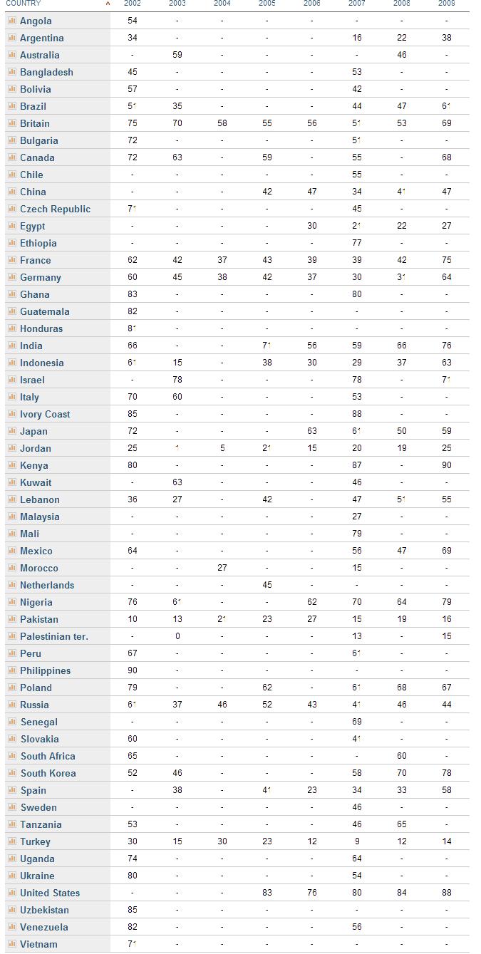
Within this context, it’s in everybody’s interests — particularly for Americans — to understand what citizens from people of different countries around the world feel about various global issues. To help in that process, the well-respected Pew Research Groups has released an interactive compilation of their Global Attitudes Project Key Indicators Database that compares international attitudes on a variety of issues:
This interactive database allows users to explore public opinion trends in 55 countries on topics ranging from attitudes toward the U.S. to people’s assessments of their own lives to views about globalization, democratization, extremism and other important issues.
Data can be searched by question, by topic or by country – and results can be displayed in map, table or chart formats. The findings are from eight surveys conducted by the Pew Global Attitudes Project from 2002-2009 among a total of more than 200,000 respondents.
Perhaps the most telling result whether citizens around the world have a favorable or unfavorable attitude overall towards the U.S. As shown below, the results show some wide fluctuations between countries and in some cases, within the same country across time (click on the graphic below to see a full-size version):
For example, European countries such as Britain, France, and Germany had high favorable attitudes of the U.S. in 2002, then declined roughly 50% in just a couple of years, then have rebounded to even higher levels in 2009 with the election of President Obama.
On the flip side, three of the U.S.’s key allies — Japan, Pakistan, and Russia — experienced a slight decline in favorable attitudes toward the U.S. between 2007/2008 and 2009 (some of which probably relates to the U.S. plunging the world into a global recession).
So what’s the take-home message here? These particular results (of course, there are many others to peruse) go to show that international attitudes can change rather quickly and can be influenced by a wide variety of reasons.
If you’ve read more than a few articles on Asian-Nation, you already know that I rely a lot on Census data and statistics for this website and blog. In addition, as an academic, I also use Census data heavily for my own research studies, as do thousands of other sociologists, demographers, statisticians, analysts, and others in all kinds of disciplines and fields.
It’s with this in mind that many of us are eagerly anticipating the 2010 Census. After the questionnaires and data collection start this spring, the actual data won’t be completely tabulated and released to the public until 2013 or so. Nonetheless, as a recent Time magazine article describes, diverse racial and ethnic groups around the country understand how important it is that the federal government has an accurate count of their population numbers and the overall importance of these Census data to American society in general:
The U.S. Census is gearing up for its once-a-decade tally of America’s population. And so are thousands of groups with a vested interest in being fully counted — since the Census determines not just seats in the House of Representatives but also how some $400 billion in annual federal funding gets divvied up, the way companies think about where to build factories and stores, and the shape of political and social discourse about issues like race, ethnicity and urban vs. rural America. . . .
Brazilians in Boston are creating public-service announcements to run on Portuguese-language radio stations. The state of California is handing out maps of neighborhoods with low participation rates in the last Census so community groups can target where to knock on doors. . . . “The Census,” says Melanie Campbell of the National Coalition on Black Civic Participation, “is all about financial resources and power.” . . .
To think about what’s at stake — beyond $3 billion in unemployment funds, $4 billion worth of rural-electrification loans, $6 billion in Head Start money and hundreds of billions of other federal dollars — consider the Burmese. Some 17,000 people living in the U.S. identified themselves as Burmese in the 2000 Census, but “we know that’s not the right number,” says Aung Naing, chairman of the Burmese Complete Count Committee. . .
In Southern California alone, there are seven or eight Burmese Buddhist temples, he says. So since the fall, Naing has been traveling the country, explaining to Burmese groups that the Census counts everybody — citizen or not — and that the data collected aren’t shared with other parts of the government, like immigration or taxing authorities (common fears that drive down response rates among many minority groups, including blacks and Hispanics).
The Time article acknowledges that there have been instances in the past where Census data has been used against particular racial/ethnic groups, such as during World War II when they were used to identify neighborhoods that had large Japanese American populations, so that they could more easily be rounded up and placed in prison camps.
There are also many Americans who don’t trust the federal government in general and will refuse to complete a Census form based solely on those grounds. As I’ve also written about, the Census Bureau has also experienced more than a few bureaucratic glitches that it will hopefully resolve under the guidance of its new boss, Secretary of Commerce Gary Locke.
For people and community organizations interested in learning more about the Census’s importance to Americans of all backgrounds, or in helping to promote participation in their own community, there are some excellent resources at CivilRights.org and NonProfitsCount.org. The Census Bureau also has numerous informational material translated in dozens of languages for downloading. As with the Time magazine article, these resources emphasize that an accurate count of the U.S.’s population forms the basis for many important but often overlooked political, economic, and social decisions that are made that end up affecting our daily lives.
As it relates to Asian Americans, the Asian American Justice Center has a nice summary of the Census’s importance to APAs. Also, the Census Bureau has produced some short videos introducing and promoting the 2010 Census, with the embedded clip below aimed specifically at Asian Americans (the clips are a little elementary but are a good way to start the discussion):
[The APACIC] was established to serve the census data needs of the national, regional, and local Washington metropolitan area Asian Pacific American communities. In September 2006, APACIC was designated as a Census Information Center (CIC) by the U.S. Census Bureau. As a member of the U.S. CIC Program, APACIC serves underserved and disadvantaged Asian Pacific American communities especially in the mid-Atlantic region by providing access to U.S. Census Bureau products.
The APACIC page linked to above also contains numerous resources and reports on various Asian American ethnic groups and other aspects of the Asian American population for those who are interested. I hope all Americans, and particularly Asian Americans, will complete and return the Census questionnaire that they’ll receive soon so that we have as accurate as possible a picture of our society and population.